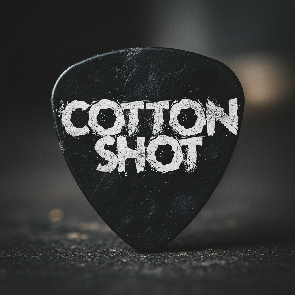
Cotton Shot is a band based out of Pittsburgh, Pennsylvania. They needed a consistent logo, as they lacked a logo, that was legitable, and consistent across all their social medias.
Full new logo, they did not want anything other than a wordmark for their band, so we kept it simple and legitable. colors stayed consitent between black and white, with the option to change colors later if wanted.
Cotton shot went from having inconsistency to haveing a logo that would now flow across all their imaging, merch, and social medias. This was a really simple project that only took about 2 hours.


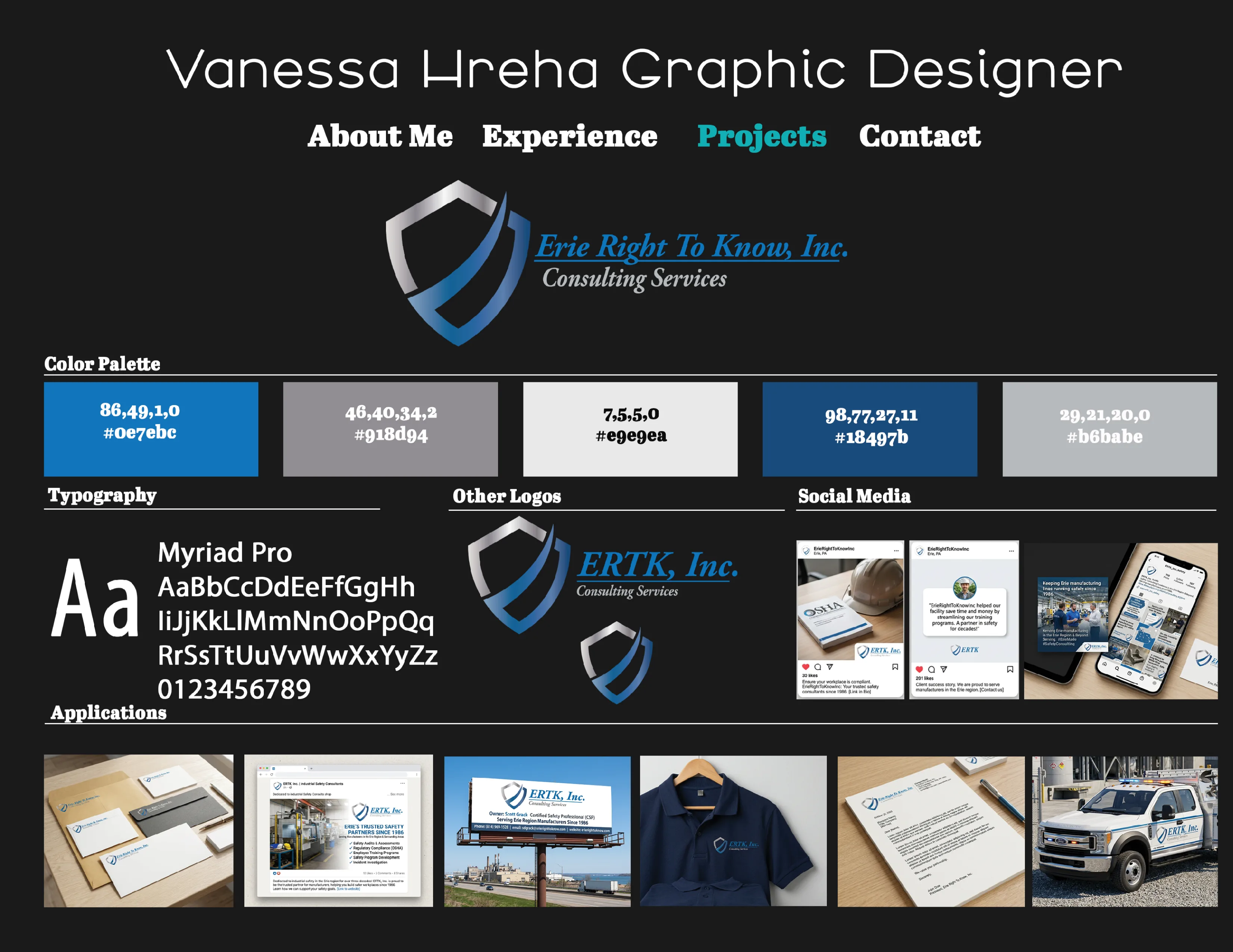
Despite offering exceptional service, ERTK lacked a professional Brand. They were missing valuable opportunities to promote their brand. Recognizing the need for a complete digital transformation, they turned to me to build their brandkit and create a lasting logo presence and brand that matched the level of care they deliver in person. .
I stepped in with a comprehensive approach to elevate ERTK Brand. I started by producing high-quality brand layout to introduce the new logo concept, colors, typography, and even mockups. I then produced a comprehensive list of assets I could create for a full media kit. .
Erie Right to Know, had a 30% traffic increase and 4x lead generation..


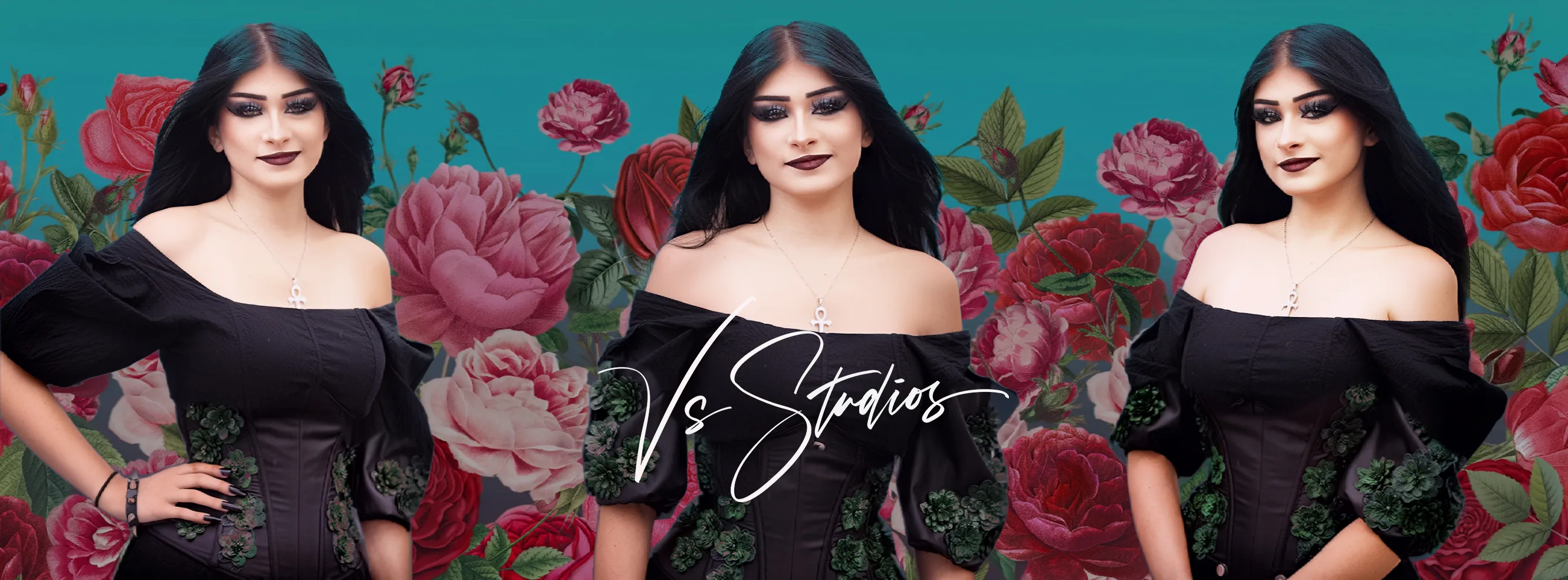
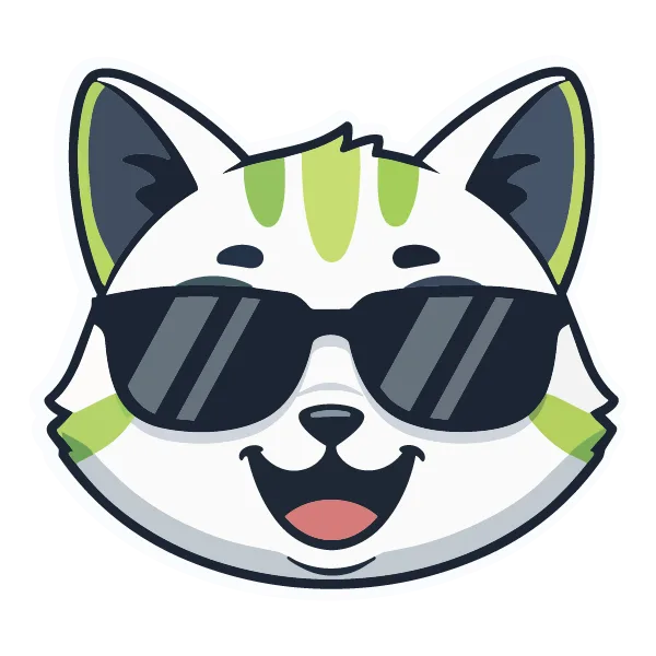
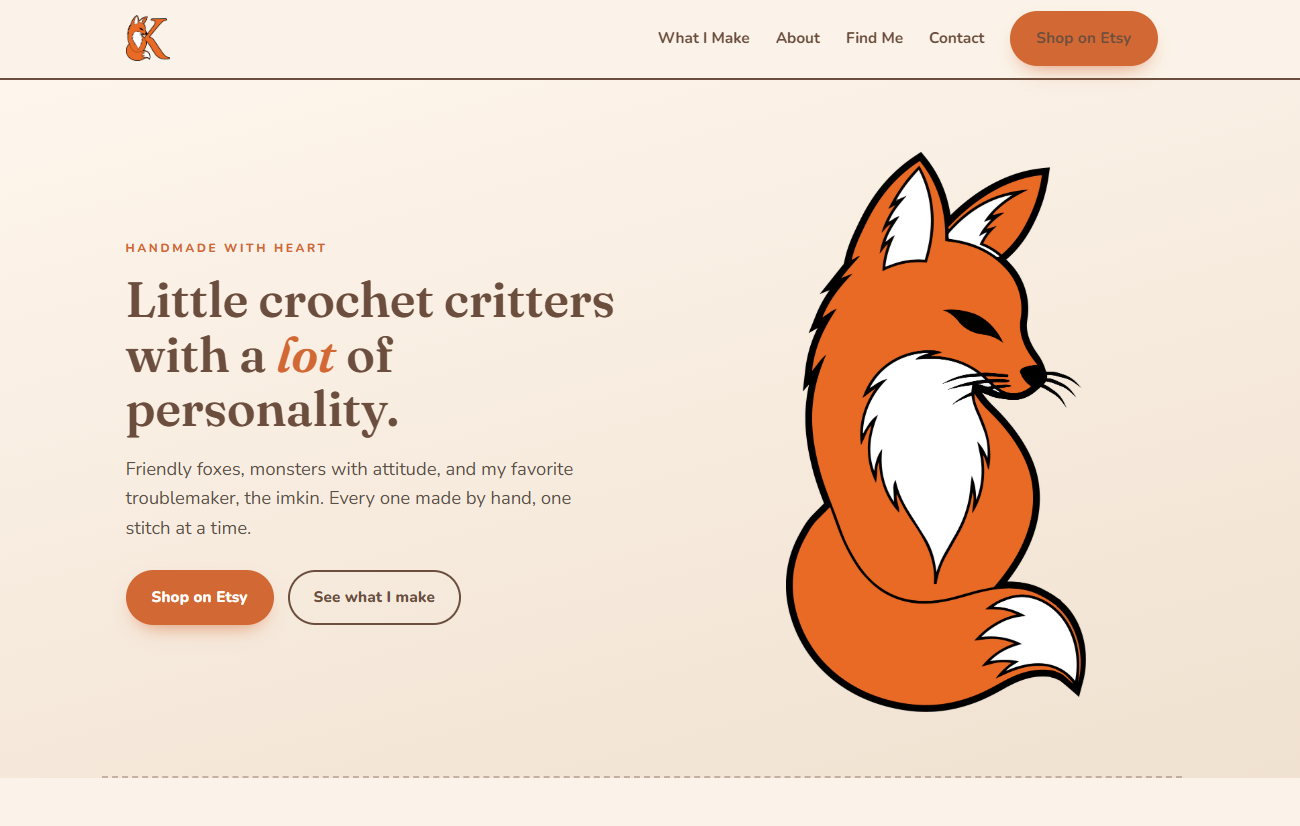
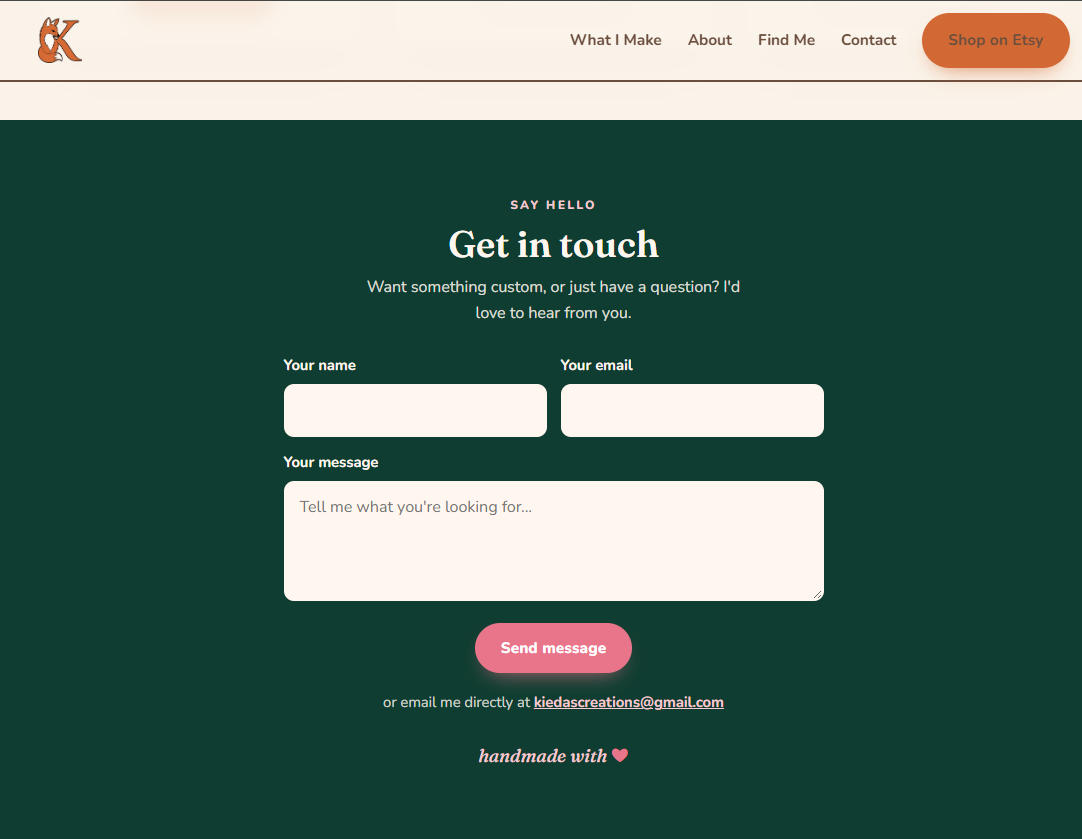
Kieda already had the talent and the products. What she did not have was a brand or a site that did her work justice, her old page was generic, locked template she couldnt fully edit, full stock copy that sounded nothing like her, with no link to her actual shop. Her logo was a hand sketched piece of art with no real assets.
She started with a generic template on someone elses account, no way to edit her own content, corporate filler copy, not her voice, no link to her shops, the fox mascot was never used. where she landed, i gave her a complete, ownable brand identity, a custom site where she can edit herself with no code, thanks to her new admin panel i created, warm copy written in her real voice, every button drives to her Etsy, the fox is now the whole brand.
The fox her fiancée drew was the one thing that had to stay. I cleaned it up into a confident, slightly mischievous mascot and curled it around a bold serif K for her name, so the character and the wordmark read as one mark. From there, a full system that works at any size and in any place. The palette captures the brand in one breath: cozy, woodsy,and a little playful. A warm base does the heavy lifting,with green and pink as the spark. Olive green was excluded on purpose, straight from the clients own intake.


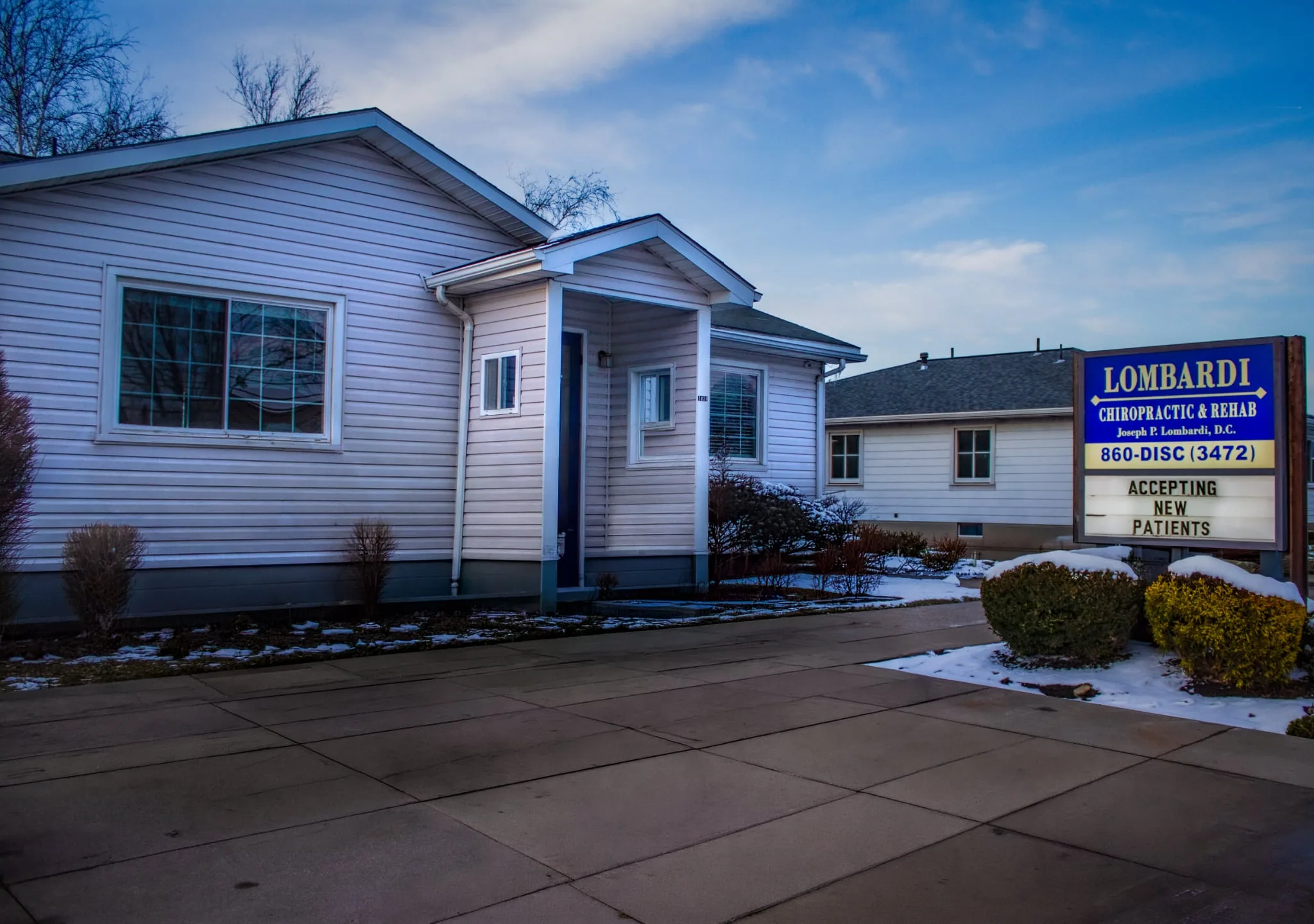
Lombardi Chiropractic and Rehabilitation is a wellness-focused practice dedicated to helping patients achieve lasting pain relief and improved mobility through personalized chiropractic care and rehabilitation services. With a commitment to holistic, patient-centered treatment, the practice serves individuals dealing with a range of conditions — from chronic back pain and sports injuries to post-accident recovery.Lombardi Chiropractic needed a strong digital presence that reflected the professionalism and care they bring to every patient interaction, and they turned to us to make that vision a reality.
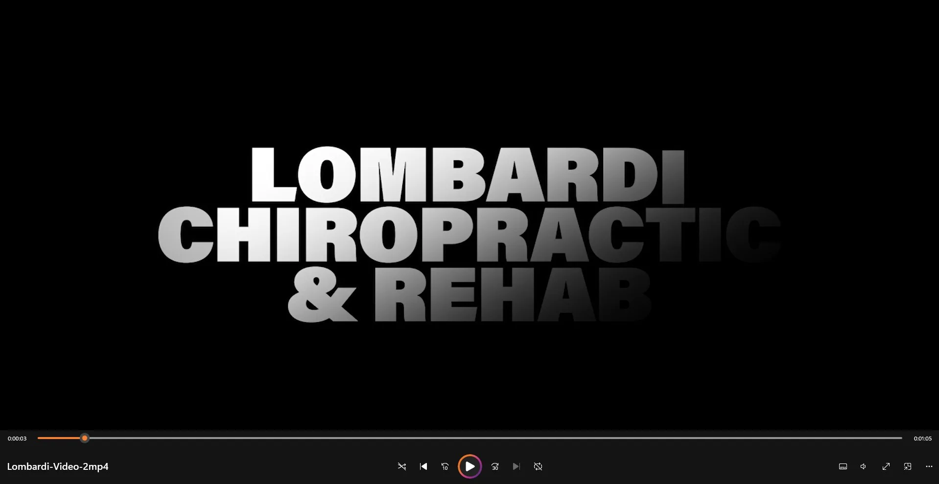
I stepped in with a comprehensive approach to elevate Lombardi Chiropractics brand and digital presence. I started by producing high-quality video content that captured the patient experience, showcased his education to customers and expertise of the practice, giving potential patients a genuine look at what sets Lombardi apart from the rest. From there, I designed eye catching social media graphics and tailored to engage their target audience and build a consistent brand across platforms. (video content in my video section) .
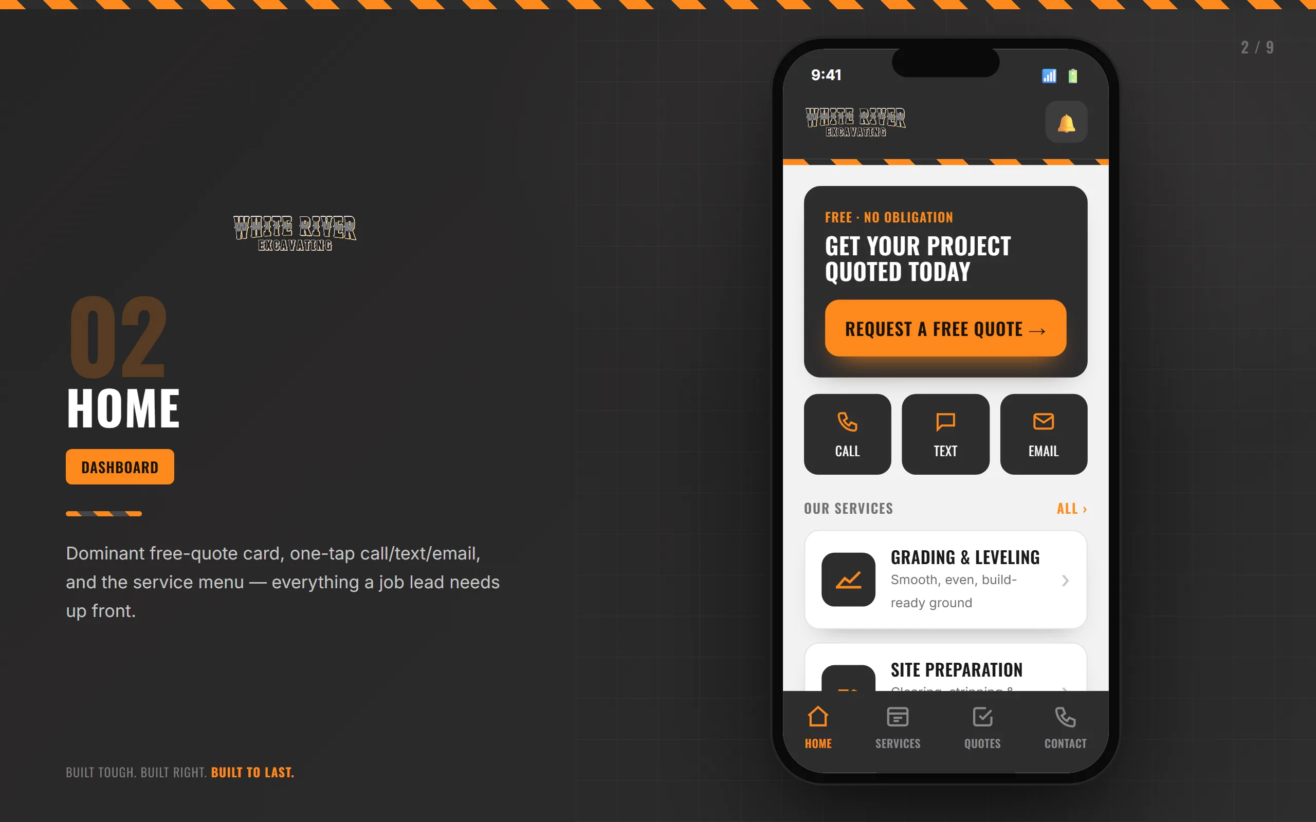
White River Excavating went from having low engagemnts, views and responses to a 50% traffic increase and a 3x Lead Generation..


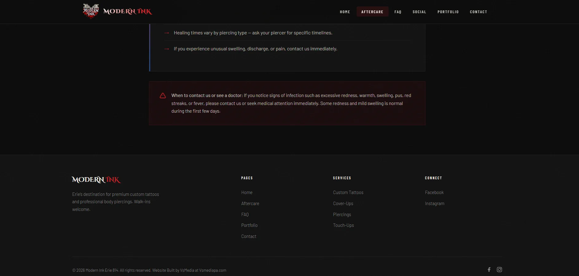
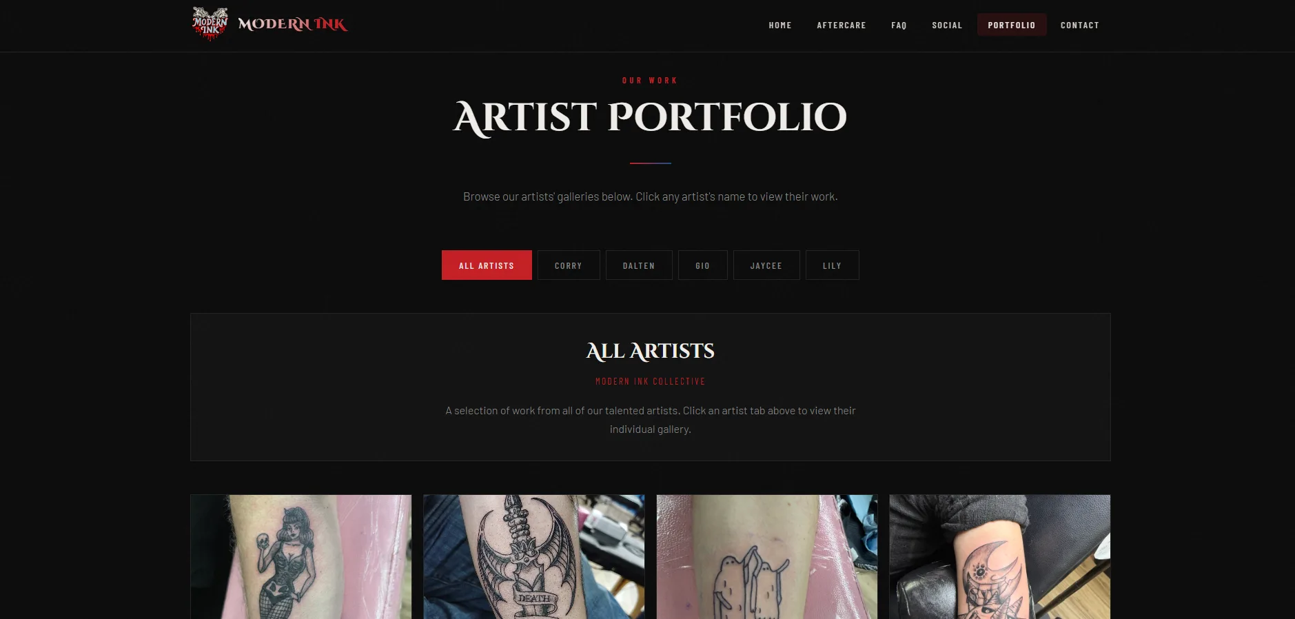
Modern Ink Tattoo, needed a professional online presence that matched the quality of their work and set them apart in Erie. Like many local tattoo shops, they faced the challenge of relying heavily on social media alone to attract clients, which limited their ability to showcase their full range of services, share important aftercare information adn convert casual browsers into booked consultations.
I stepped in with a comprehensive approach to elevate Modern Ink Tattos brand and digital presence. I started by producing a high-quality website that captured the client experience, showcased portfolios, highlighted the expertise of the practice- giving potential clients a genuine look at what sets Modern Ink Tattoo apart from the rest. .
Modern ink Tattoos went from having low engagemnts, views and responses to a 50% traffic increase and a 3x Lead Generation..


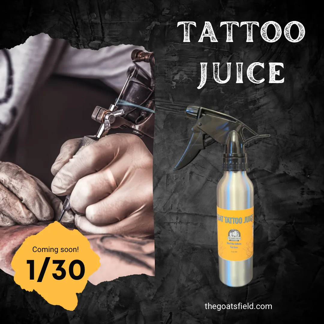
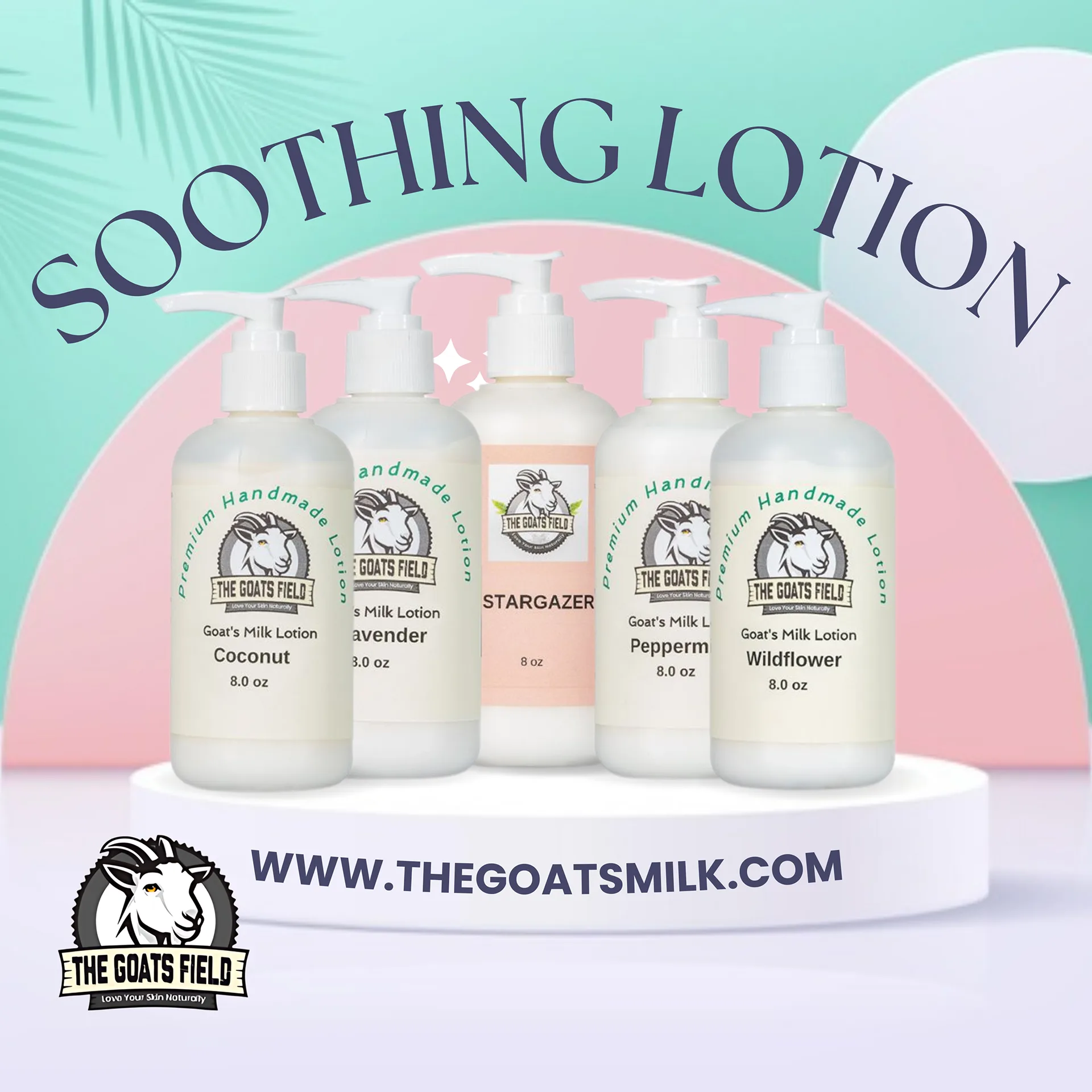
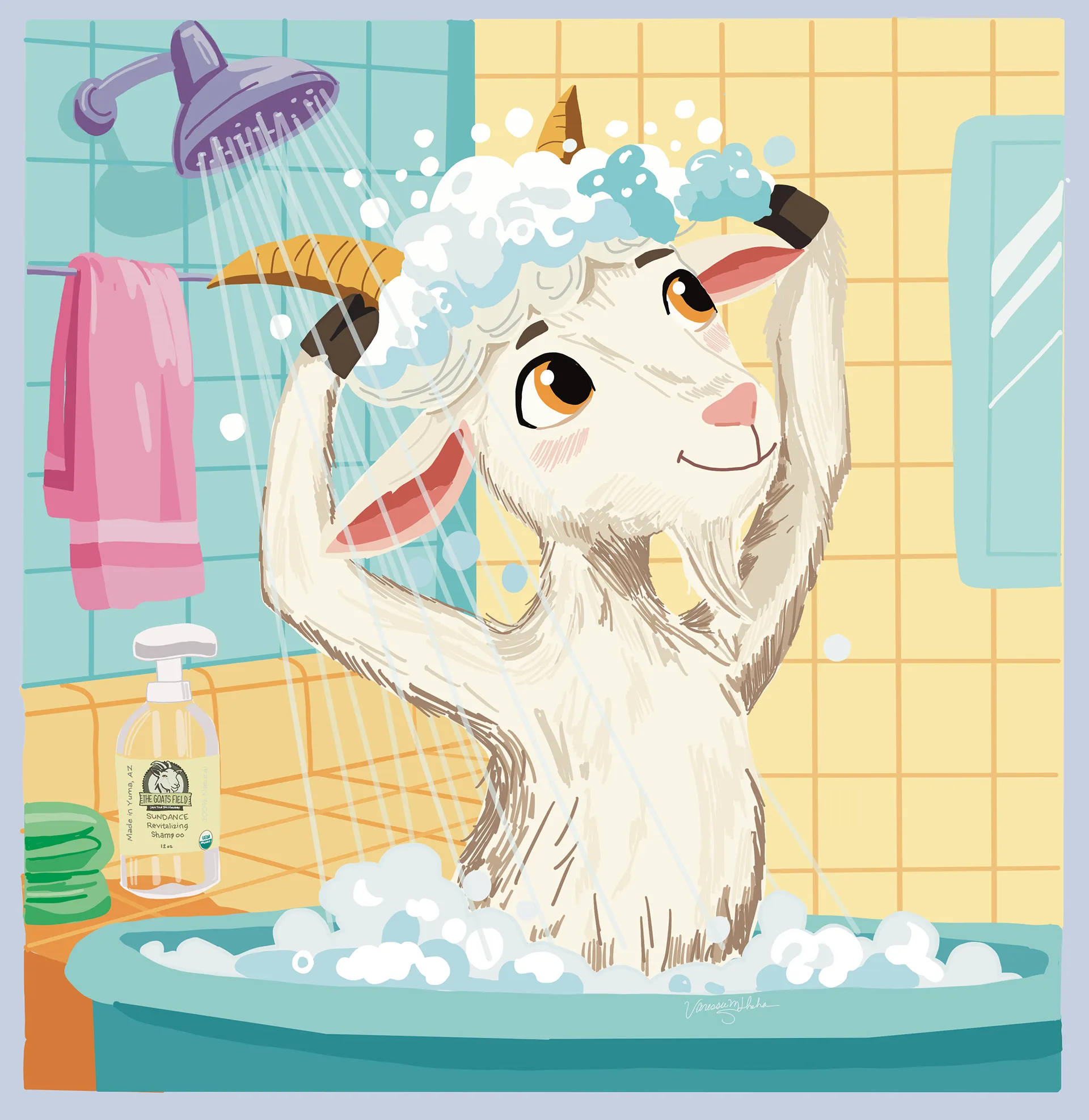
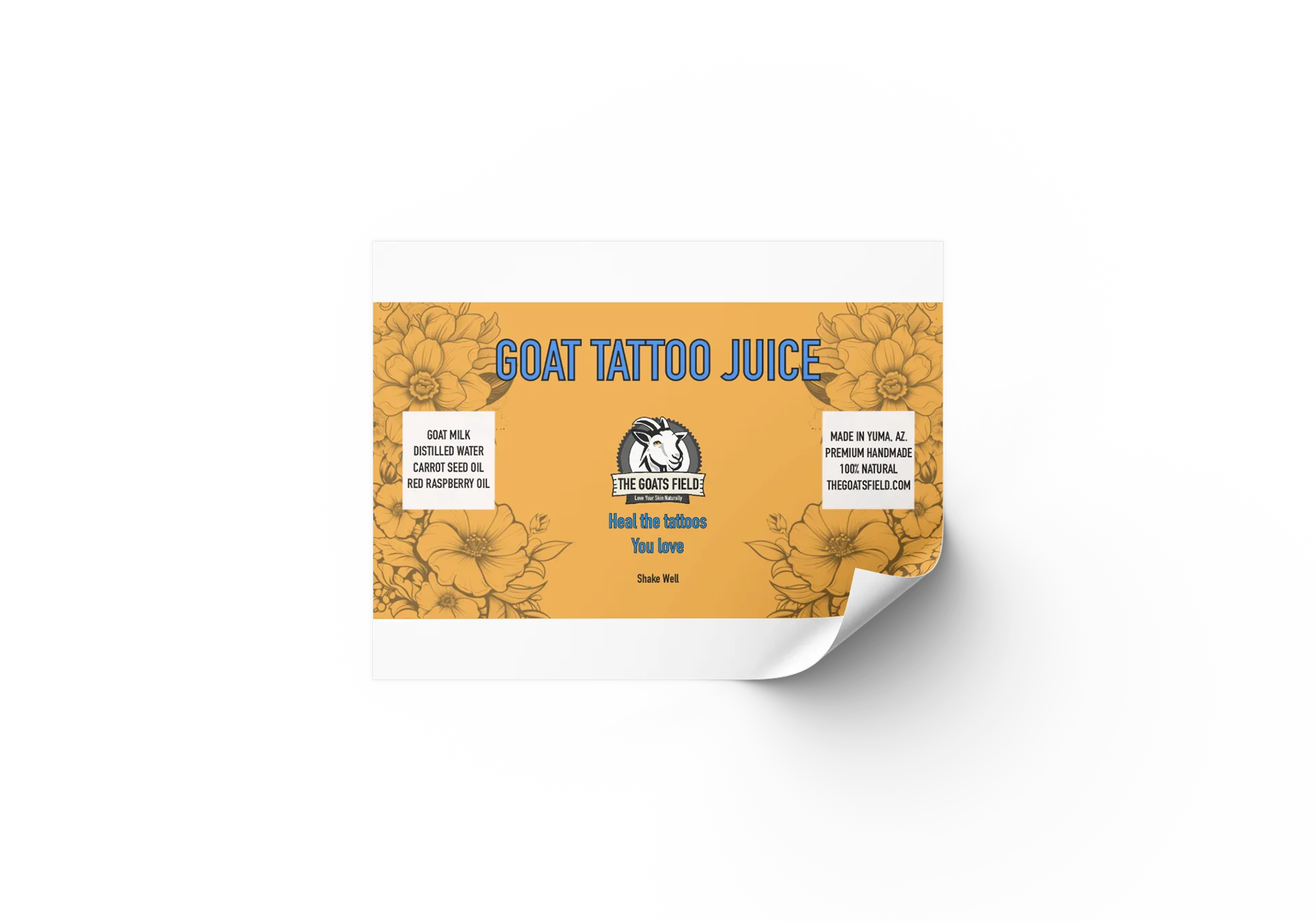
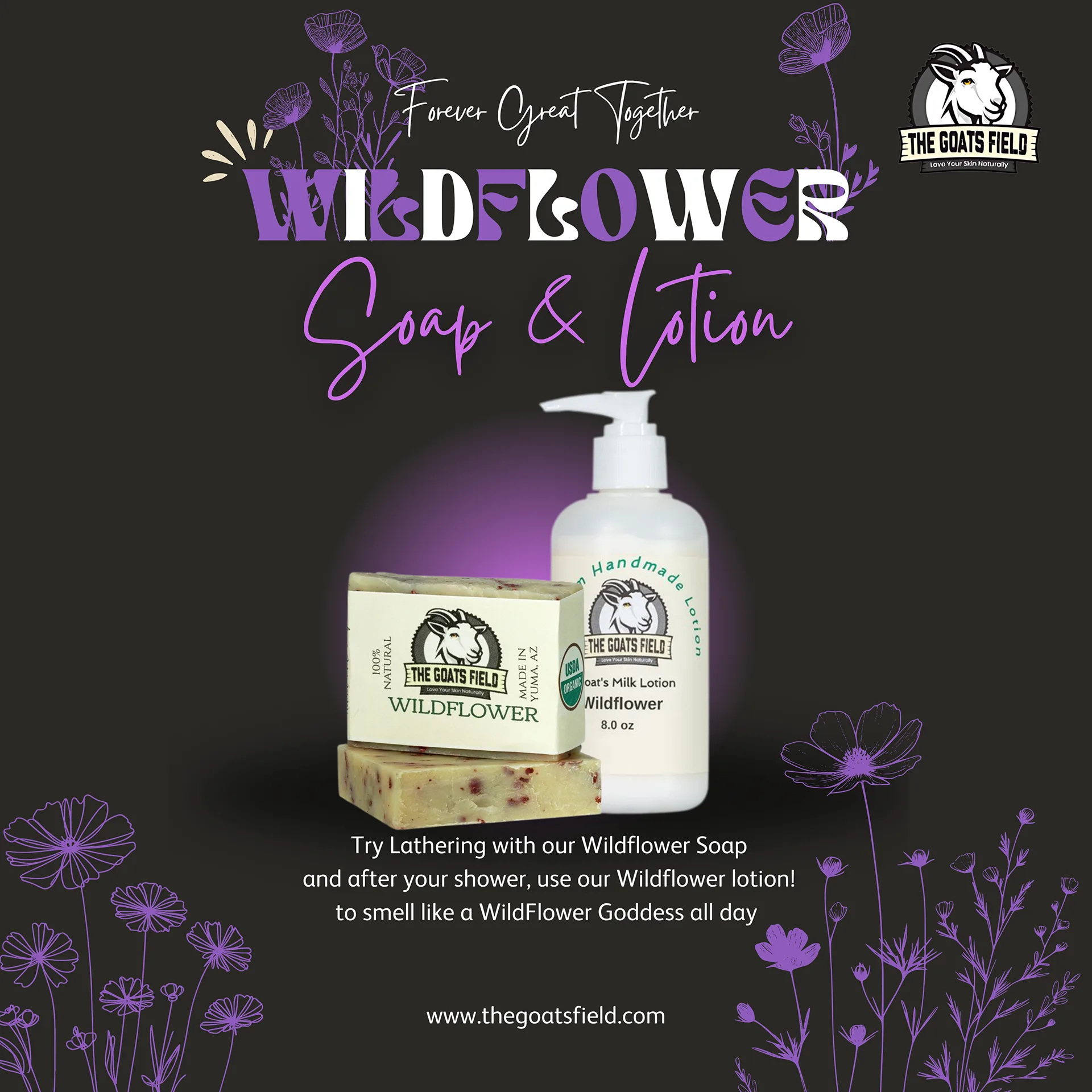
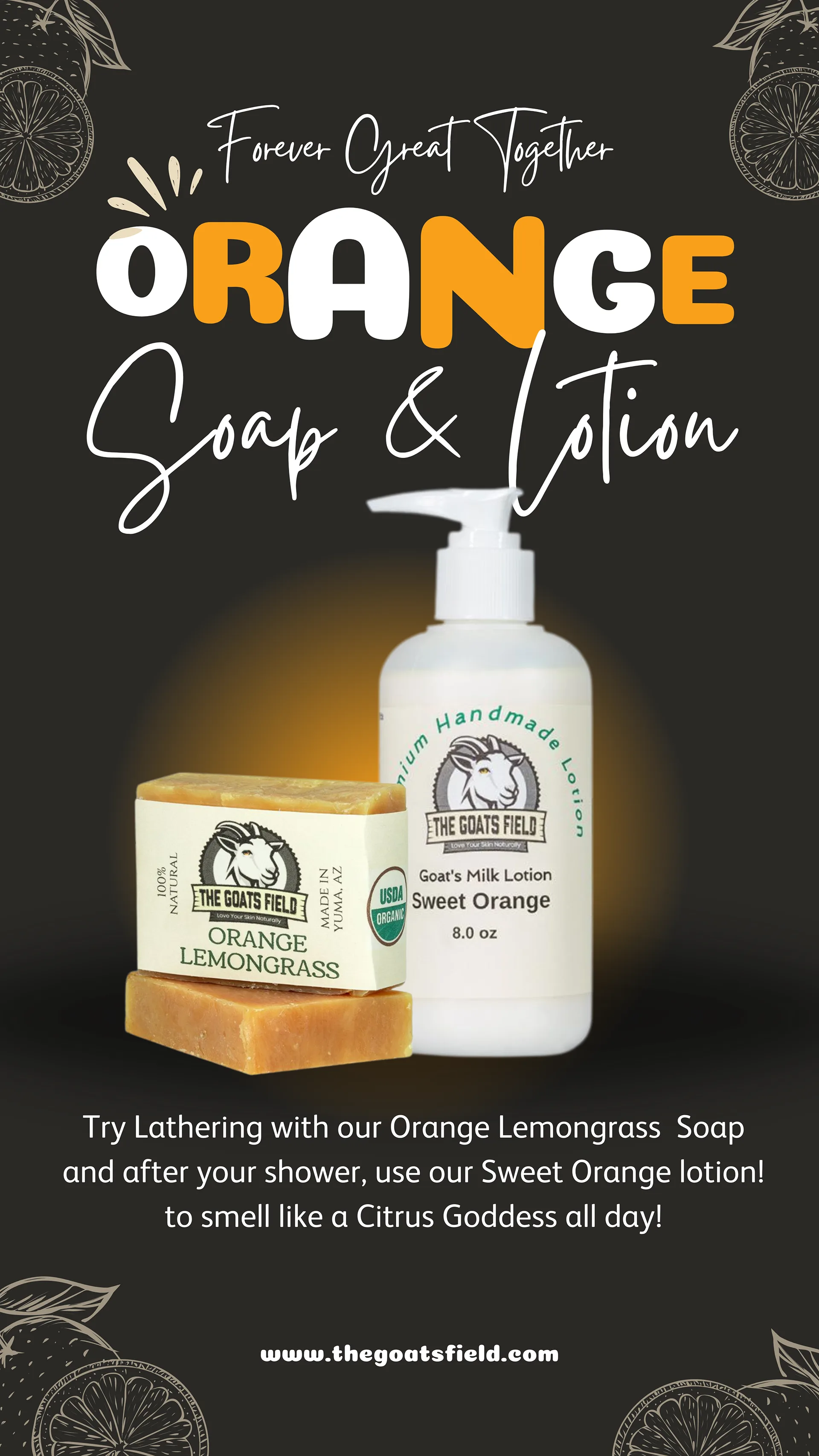
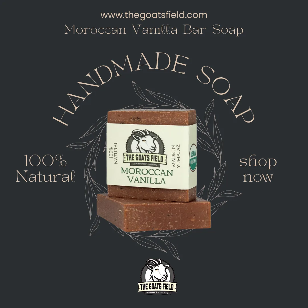
The Goats Field, had the culture, and the product, what they needed was the creative firepower to actually communicate that online. Their existing content was not doing justice to the brand, They needed cohesive graphics design, photography, video reels to sell their brand, stop the scrll and paid ads that converted instead of just burning the budget. They also needed a UGC strategy that would let their real community do the talking.
I took a full-service approach to the goats field creative and marketing needs. From brand visuals to paid campaigns to community-driven content, every piece was built with intention. (videos can be viewed in my video section.) I did their graphic design, video marketing, paid advertising and also recorded some UGC content for The Goats Field.
the Goats Field went from having low engagemnts, views and responses to a 4x Ad Engagment, 60% Follower Growth and 3x the Content output..


.webp)

.webp)


.webp)


 - 1.webp)

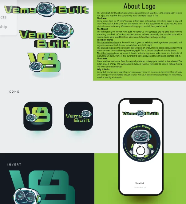
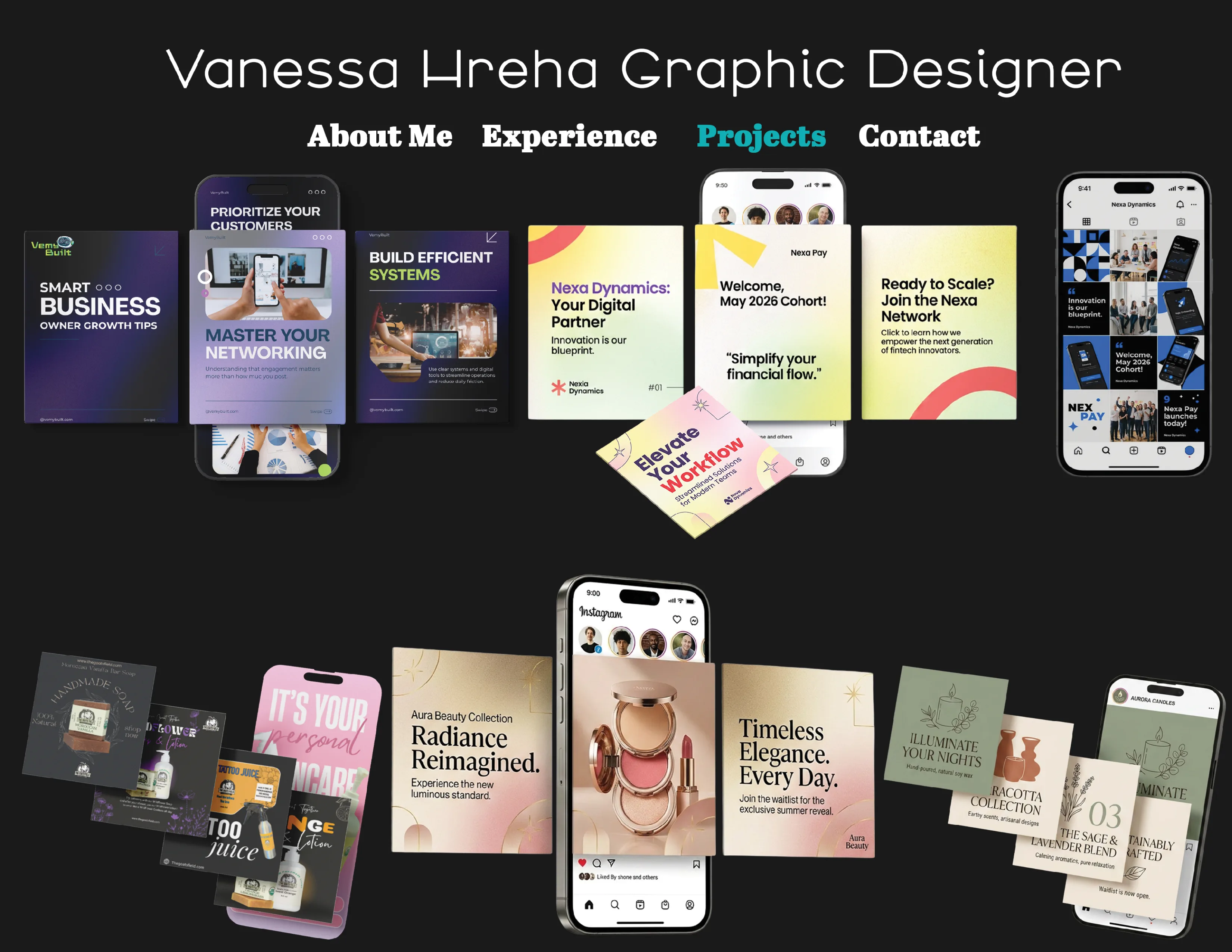
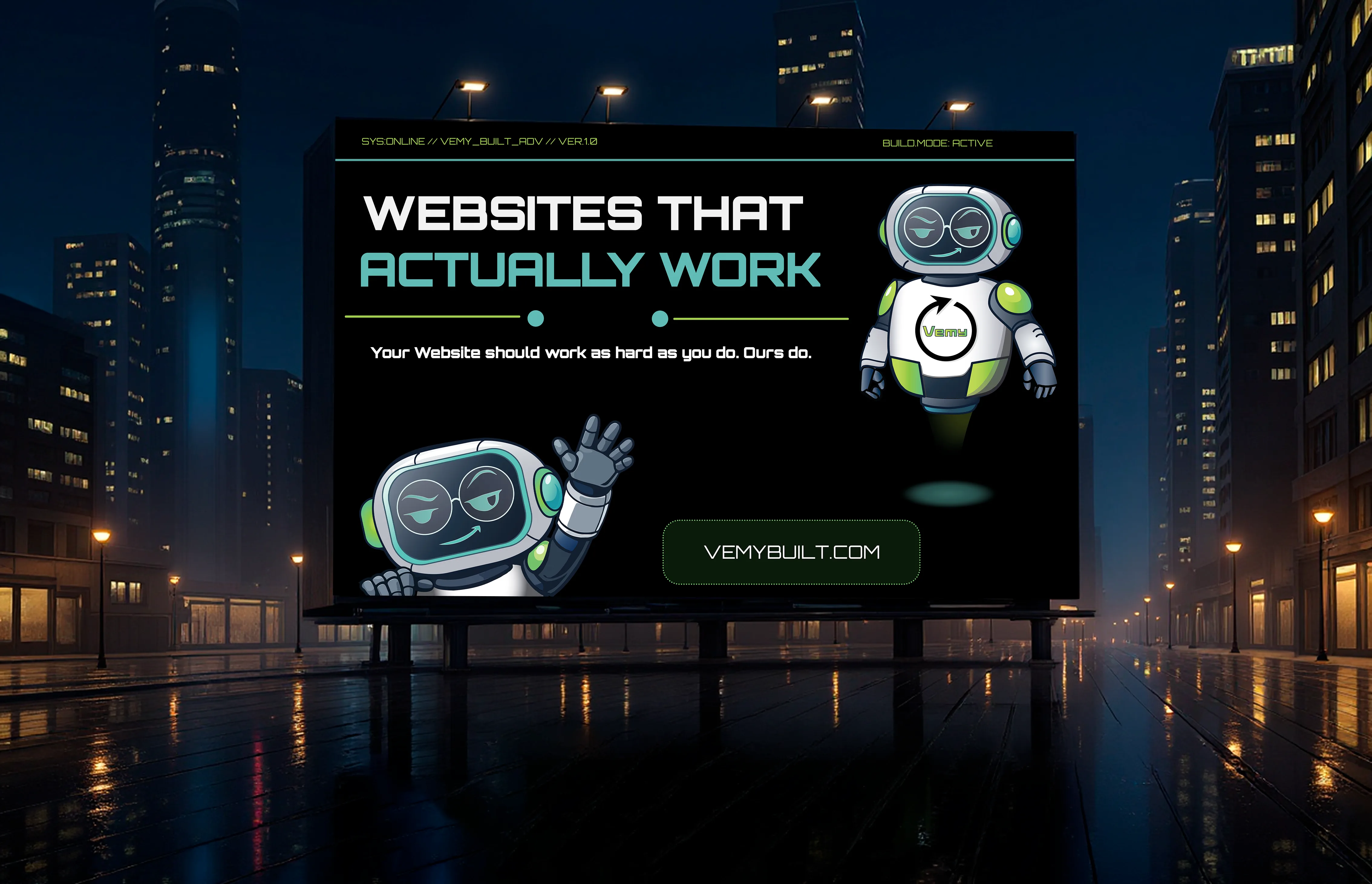
Vemy Built needed two things at the same time: a brand that could hold up in the real world, and a pitch deck that could hold up in a room full of people with money. Those are two different problems. The brand has to say who you are at a glance — on a shirt, a truck, a business card, a website. The pitch deck has to tell a story under pressure, slide by slide, no room for confusion. They had neither. We built both.
The brand came first. Full identity system: logo, alternate marks, color palette, typography, and usage guidelines — built to work across every surface a real company actually touches. Workwear, signage, vehicles, proposals, digital. The mark had to feel established without looking stiff. Marketing is a trust business. Once the identity was locked, I built the pitch deck around it. Every slide carries the brand. The deck isn't just a presentation. It's proof of concept. If a company can't get their own materials to look right, why would anyone trust them?
Vemy Built walked away with a brand system and a pitch deck that matched. Not two separate things that happened to share a name — one coherent package that could walk into any room and hold its own. The guidelines meant any future designer, printer, or vendor could work from the same playbook. The pitch deck was ready to present the day it was delivered. All work custom. No templates, no stock, no AI.


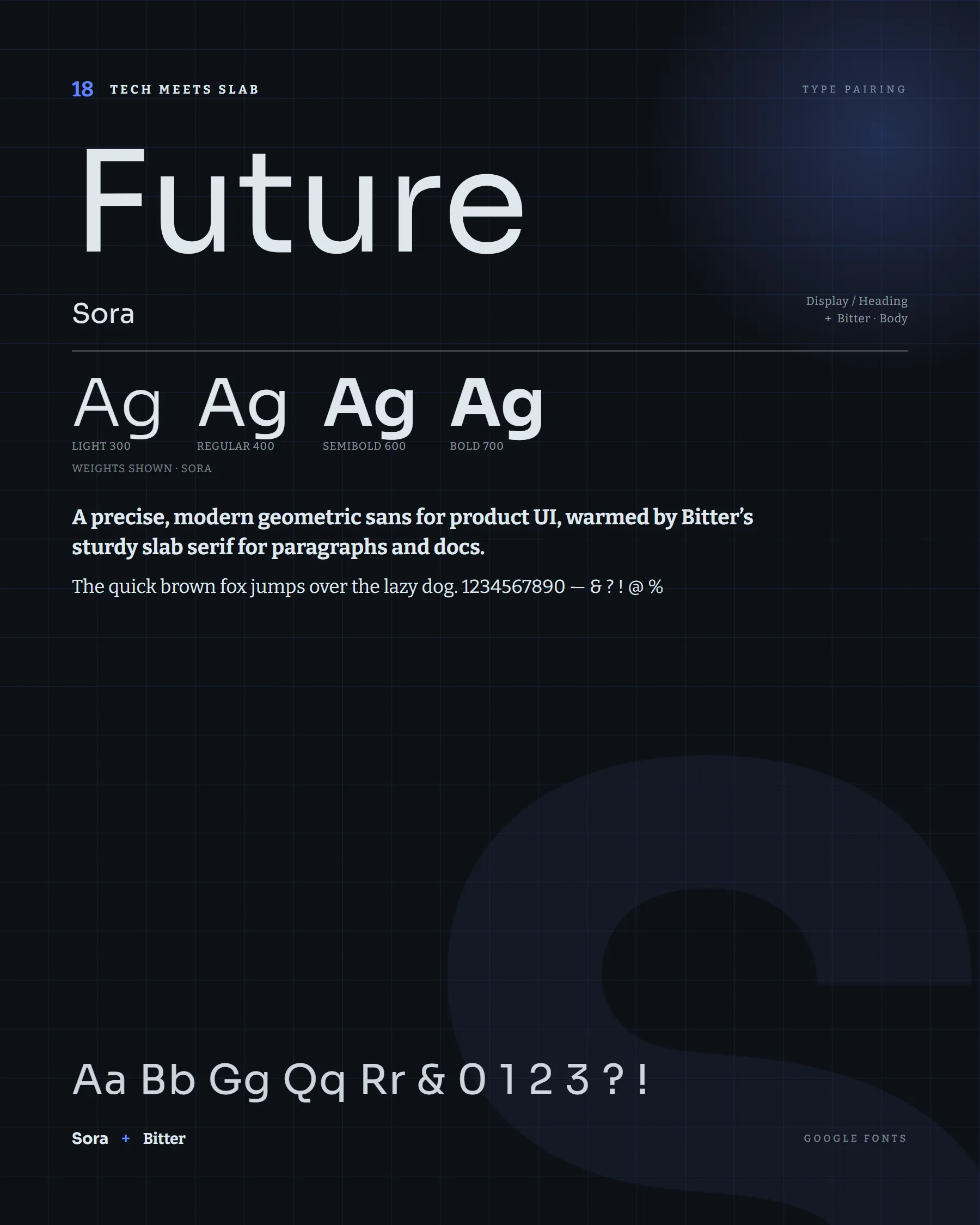
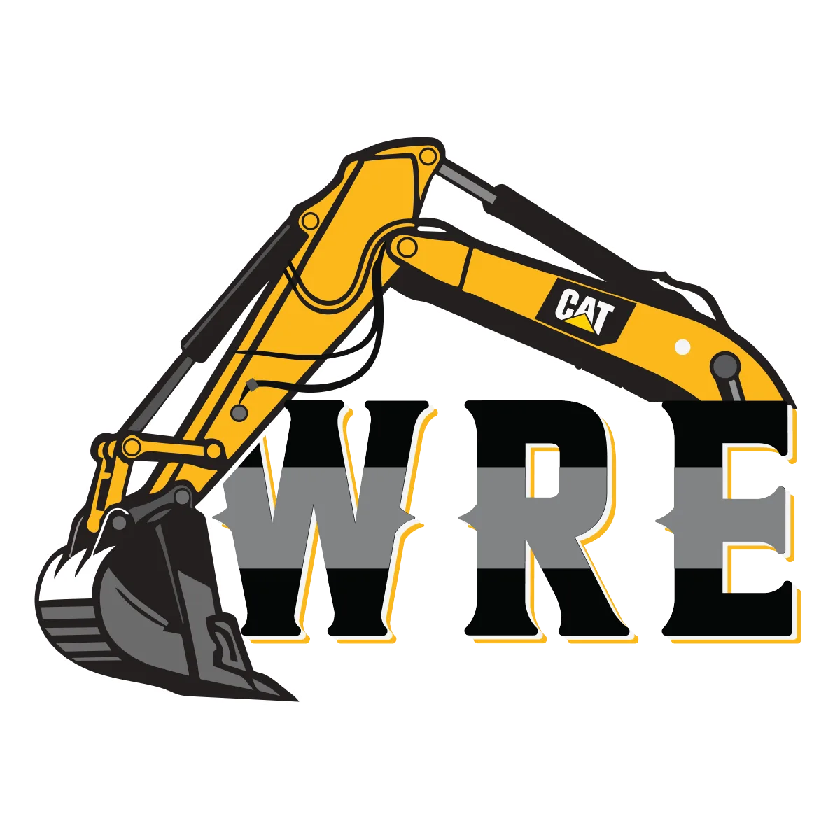
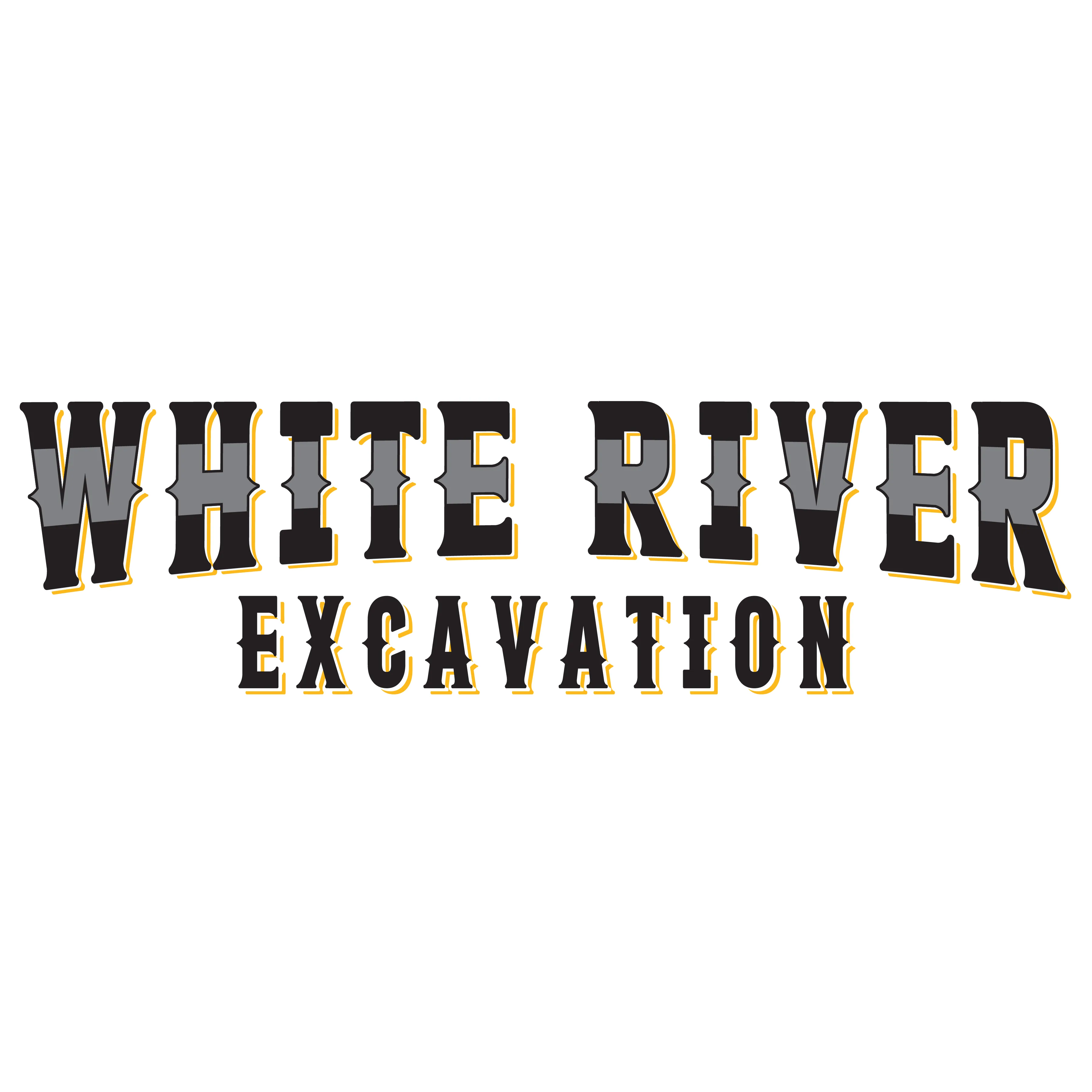
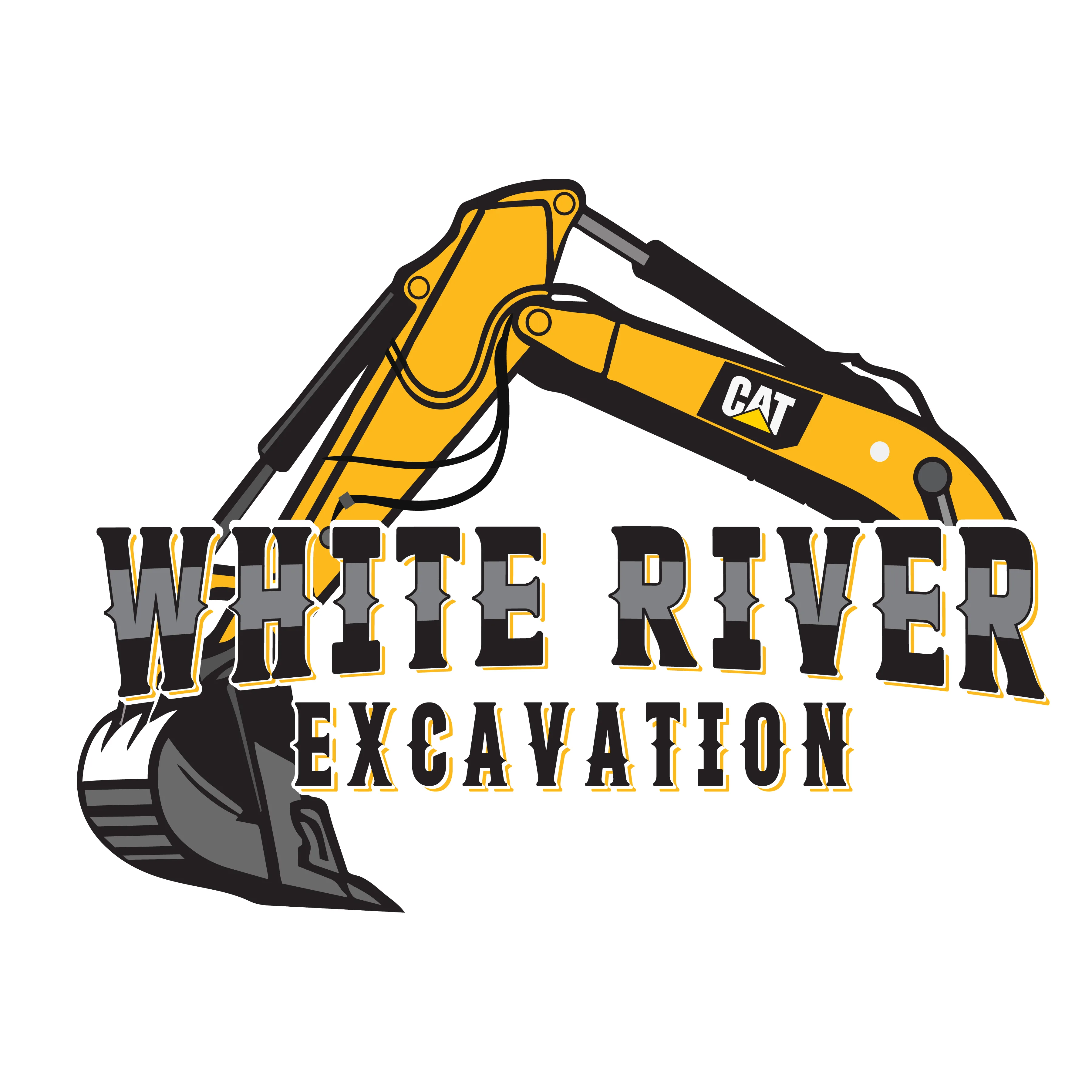
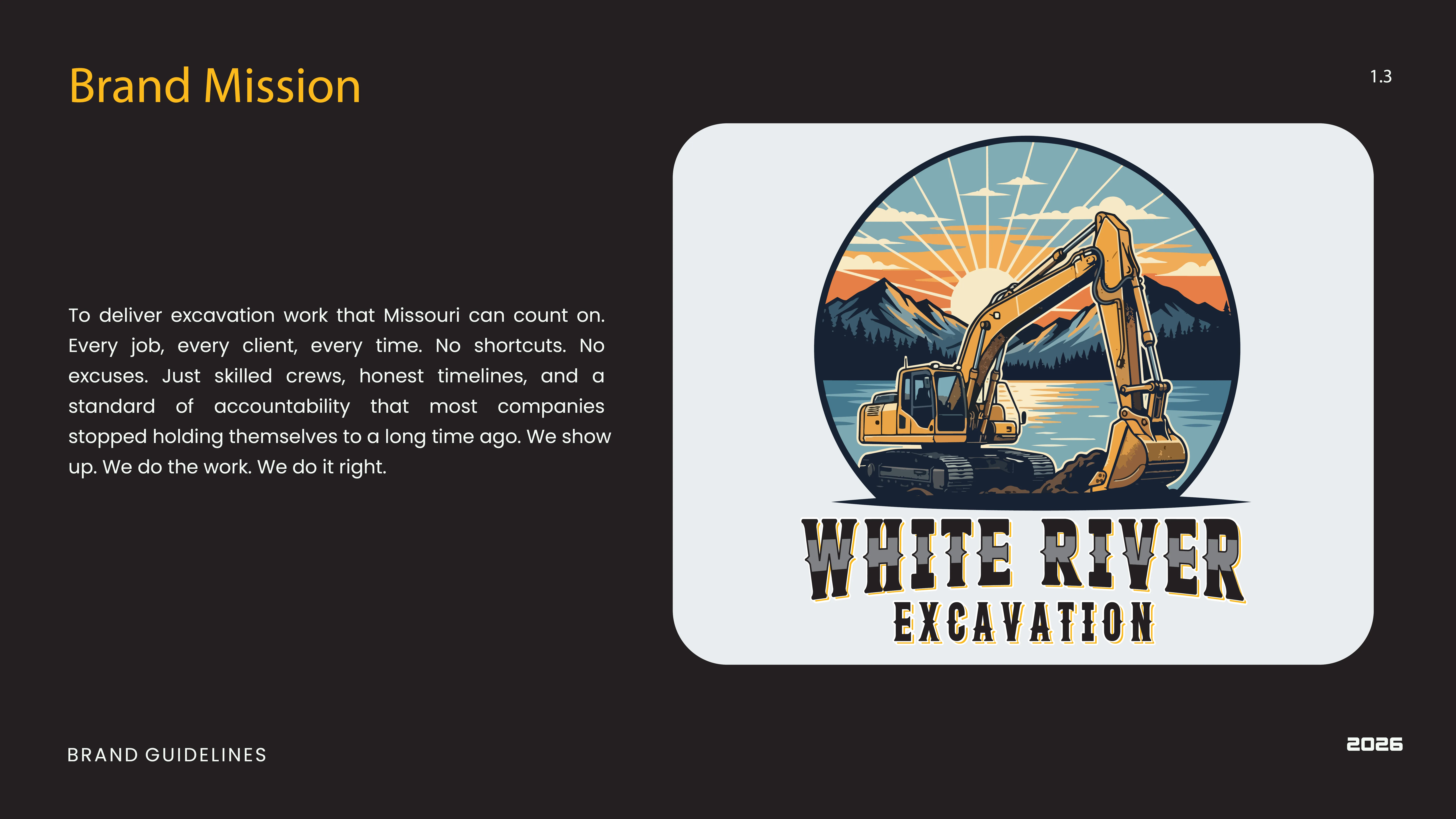
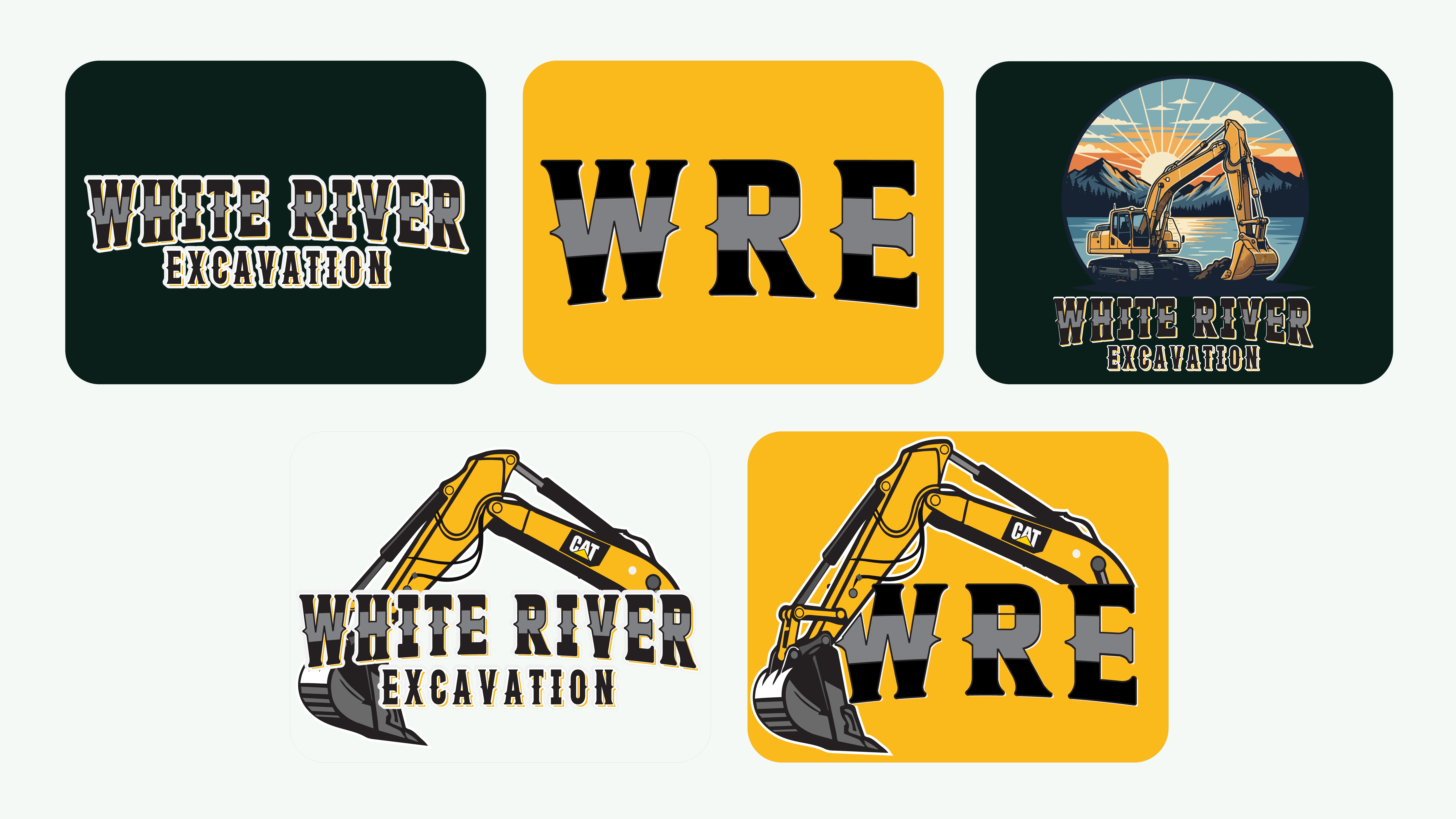
White River Excavating came in with nothing. No logo, no colors, no guidelines — nothing to hand a printer, put on a truck, or give a customer. They needed a full identity built from the ground up. The challenge with trades companies is that most of them look the same. Generic font, generic colors, clip art equipment. White River needed to look like a business that knew what it was doing before anyone ever saw them on a job site.
Full brand identity from scratch, starting with the logo mark and working outward through every application. The goal was something solid and serious without looking like a corporate template. A local company with real equipment and real crews deserves a brand that reflects that. Every decision — the mark, the palette, the type — was built to work in the real world. On a truck door. On a hard hat. On an invoice. On a job site sign in the mud at 6am. Then I documented everything in a brand guidelines package so the client could hand it to any vendor and get consistent results without having to explain it every time.
White River Excavating went from having nothing to having a complete brand they could actually use. Every deliverable was production-ready — files for the sign shop, the printer, embroidery, all formats included. They didn't have to explain themselves to every vendor. They just handed over the package.


.png)
.png)
.png)
.png)
.png)